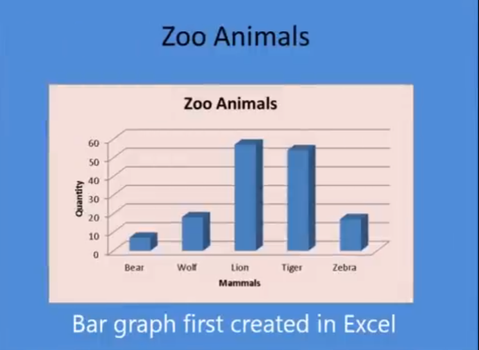
A blind student has demonstrated remarkable skills by completing complex Excel graphs and seamlessly integrating them into PowerPoint presentations. This achievement in Excel Graphs and PowerPoint Integration highlights the potential of assistive technologies and the importance of accessibility in education. He got an A on this project.
A blind student successfully completes sophisticated Excel graphs, showcasing their proficiency with assistive technology. They seamlessly insert these graphs into PowerPoint, showcasing their ability to integrate complex data into presentations. This demonstrates their proficiency with both Excel and PowerPoint, highlighting their technical skills.
This process involves several steps:
- Creating the Graph in Excel:
- Data Entry: The student inputs data into Excel using keyboard commands and screen reader software like JAWS.
- Graph Creation: Using commands such as
Alt + N + Sto insert a scatter plot andAlt + J + Fto add a trendline, the student creates a detailed graph. - Customization: The graph is customized by adding titles, labels, and trendlines, ensuring all elements are accessible and correctly formatted.
- Inserting the Graph into PowerPoint:
- Copying the Graph: The student uses
Ctrl + Cto copy the graph from Excel. - Insert Graph: He has used the insert menu to insert graphs on the slides
- Pasting into PowerPoint: Using
Ctrl + V, the graph is pasted into a PowerPoint slide, where it can be further edited and formatted. - Creating Sound
- Copying the Graph: The student uses
If you require Access Training, let us know. More videos on Excel Lessons and Scatter Plots