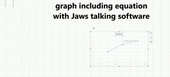
A quadratic trendline with a scatter plot shows the relationship between two sets of data that form a curved pattern. Instead of a straight line, it fits a U-shaped or upside-down U-shaped curve, helping to see trends when data increases or decreases at different rates. Using an Excel Quadratic Trendline with scatter plot makes it useful for predicting changes that don’t happen in a straight line, like acceleration or deceleration. The equation on the graph helps explain this relationship and can be used for future predictions.
Using keyboard commands in Excel, combined with JAWS screen reader, makes it possible to create a quadratic trendline on a scatter plot while also displaying the equation. This process is essential for visually impaired users who need accessible methods to perform complex data analysis. By using commands like Alt + N + S to insert the scatter plot and Alt + J + F to add the quadratic trendline and display the equation, you can efficiently work with Excel’s graphing tools while maintaining full accessibility with JAWS.
Excel Quadratic Trendline with scatter plot Keyboard commands

Here are the keyboard commands to add a quadratic trendline with a scatter plot and display the equation in Excel using JAWS:
- Create Scatter Plot:
- Select data with Shift + Arrow Keys.
- Press Alt + N, then S to insert a scatter plot.
- Add Quadratic Trendline:
- Select the graph with Arrow Keys.
- Press Alt + J + F, then A for chart options.
- Press T to add a trendline, then press Q for polynomial (quadratic).
- Show Equation:
- Press Alt + J + F, then T to show the trendline equation on the chart.
These steps work seamlessly with JAWS for accessible chart creation. Learn more Excel graphing
Excel Trendline with Scatter Plot
