Search results for: “excel”

  • Math Work in Excel: Solving Inequalities with Keyboard Shortcuts

    Dr. Robinson introduces a lesson on using Microsoft Excel to solve math work, specifically focusing on inequalities and graphs. She begins by guiding students on how to put Excel in focus to tackle various math problems in Excel. This helps students to optimize their math work in Excel effectively. Next, she instructs them to create a template using a number line. To insert symbols like less than or greater than signs, students use the Alt + N and then U commands to insert bullets or symbols.

    For students with a numpad, Alt + 7 and Alt + 9 quickly insert a hollow or solid bullet, respectively. For those without a numpad, they can use the Insert + Symbols option. Students then align their number line by inserting a bullet in the middle, ensuring four dashes on each side for perfect centering when solving math work in Excel.

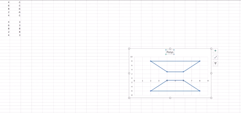
    Math Work in Excel and More

    image of excel to solve math problems with inequality graph lines

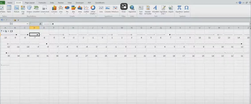
    To center content, students use the Applications key and press F. They adjust the horizontal and vertical alignment to ensure everything is perfectly centered. This is a useful step when handling math problems in Excel. After completing their problems, students select the content using Shift + Right Arrow and copy it using Ctrl + C. This entire process enhances their skills in doing math work in Excel.

    When pasting into Microsoft Word with Ctrl + V, students have various formatting options. By pressing the Control key and right arrow, they can select different formatting options for their pasted content. They can also Alt H to home and V to paste and right arrow through options. This flexibility allows blind students to format and customize their graphs just like their sighted peers when solving math problems in Excel. After the student pastes an image, they press the Applications key and up arrow to select Alt Text and type the description. Once they finish typing, they press Ctrl + Space and C to close the navigation pane and return to the document.

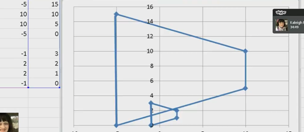
    Dr. Robinson concludes by showing examples of completed math problems in Excel and graphs, demonstrating how well-formatted the number lines and inequalities look. Blind students can confidently create hollow and solid bullets, as well as inequalities, just like other students, thanks to the accessible features in Excel. This process ensures they stay engaged in their learning, achieving the same results as their peers when doing math work in Excel. Make sure your display is working well.

    Excel Quadratic Trend-line with scatter plot graph including equation in Excel with Jaws talking software

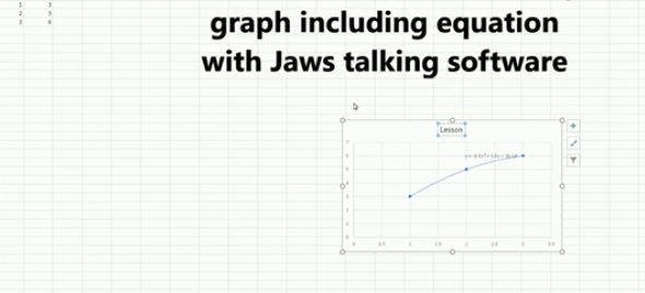
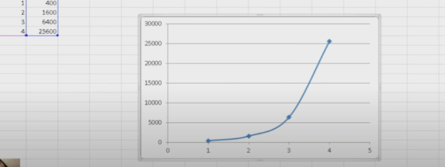
    Curved line in Excel graph with screen reader

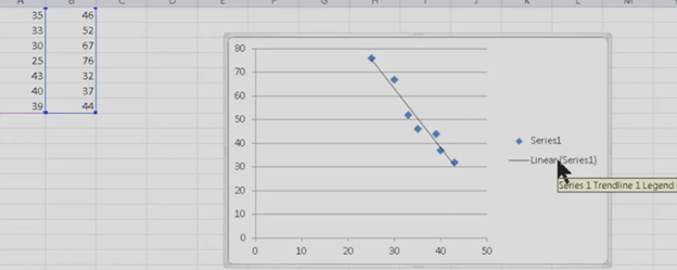
    Excel Scatter Plot with Trendline

    Solving inequalities

    Create Histogram

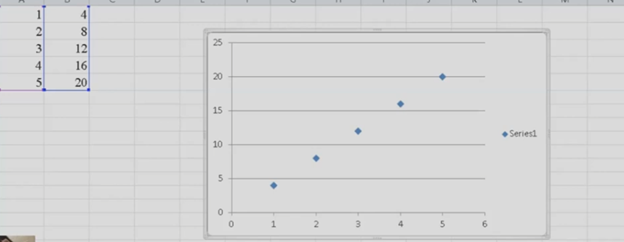
    Excel Trend-line with Scatter Plot

    Other Excel Lessons that you can do in Sheets

    Flashcard Study

    Other excel lessons with commands.

  • Excel for Geometry: Create Shapes and Label Graphs with JAWS

    Using Excel for geometry tasks, such as inserting shapes and labeling graphs, can be highly effective, especially for visually impaired students. By leveraging keyboard commands, students can efficiently navigate through Excel’s features. For instance, pressing Alt + N opens the Insert tab, and SH brings up the Shapes menu, allowing users to select and draw shapes. To label a graph, students can use Alt + JC to access the Chart Tools Design tab, followed by A to add chart elements like data labels and titles. These steps not only enhance the learning experience but also demonstrate the power of assistive technology in making complex tasks accessible and manageable

    Start at the top of A1 and start adding data in both A and B. Make sure you add a space between you 2 Geometric shapes so they can mirror each other or whatever the assignment requires.

    Here are other options for Geometry shapes

    Here’s how you can insert shapes and label a graph in Excel using keyboard commands:

    Geometry: create Shapes and label graphs
    Geometry: create Shapes and label graphs

    Excel for Geometry: Create Shapes and Label Graph

    Inserting Shapes

    1. Open Excel and navigate to the worksheet where you want to insert shapes.
    2. Press Alt to activate the ribbon shortcuts.
    3. Press N to go to the Insert tab.
    4. Press SH to open the Shapes menu.
    5. Use the arrow keys to select the shape you want, then press Enter.
    6. Click and drag (or use arrow keys) to draw the shape on your worksheet.

    Labeling a Graph

    1. Select your chart by pressing Ctrl + Arrow keys to navigate to it.
    2. Press Alt to activate the ribbon shortcuts.
    3. Press JC to go to the Chart Tools Design tab.
    4. Press A to open the Add Chart Element menu.
    5. Press D to select Data Labels, then choose the desired position using the arrow keys and press Enter.

    Adding a Chart Title to Excel for Geometry

    1. Select your chart.
    2. Press Alt to activate the ribbon shortcuts.
    3. Press JC to go to the Chart Tools Design tab.
    4. Press A to open the Add Chart Element menu.
    5. Press T to add a chart title, then type your title and press Enter.

    These steps should help you efficiently create Shapes and label graphs in Excel using keyboard commands. If you need more detailed instructions or have any specific questions, feel free to ask!

    Other Excel Lessons

    Another Student Mastering Excel with PPT integration

    Create a Histogram

    Scatter plot with trendline

    Excel line plot graph-copy to Word for Math

    Complete an excel graph and copy into Word document with screen reader

    If your fingers need to see multiple lines on your display, then this lesson will help

  • Excel Histogram with Keyboard Commands

    Creating a histogram in Excel using keyboard commands makes data analysis quick and efficient. First, select your data with Shift + Arrow Keys. Then, insert the chart using Alt + N, followed by H to choose a histogram. This process allows you to visualize data distributions without a mouse, making it both accessible and streamlined. By using these simple commands, you can create effective histograms in just a few steps.

    To create a graph in Excel using keyboard commands:

    1. Select Data: Highlight the data using Shift + Arrow Keys.
    2. Insert Chart: Press Alt + N to open the Insert tab.
    3. Open Histogram Option: Press H to select the Histogram option from the Charts menu.
    4. Choose Histogram: Use Arrow Keys to navigate and press Enter to insert the histogram.

    Now you have a histogram using just the keyboard.

    Excel Histogram with keyboard commands
    Excel Histogram with keyboard commands

    When you finish, you can move data into DESMOS and emboss the graph

    Solving inequalities

    Create Histogram

    Excel Trendline with Scatter Plot

    Other Excel Lessons that you can do in Sheets

    Flashcard Study in Sheets

    Increase your Technology knowledge via more lessons

  • Excel Quadratic Trendline with Scatter Plot Graph Including Equation Using JAWS

    A quadratic trendline with a scatter plot shows the relationship between two sets of data that form a curved pattern. Instead of a straight line, it fits a U-shaped or upside-down U-shaped curve, helping to see trends when data increases or decreases at different rates. Using an Excel Quadratic Trendline with scatter plot makes it useful for predicting changes that don’t happen in a straight line, like acceleration or deceleration. The equation on the graph helps explain this relationship and can be used for future predictions.

    Using keyboard commands in Excel, combined with JAWS screen reader, makes it possible to create a quadratic trendline on a scatter plot while also displaying the equation. This process is essential for visually impaired users who need accessible methods to perform complex data analysis. By using commands like Alt + N + S to insert the scatter plot and Alt + J + F to add the quadratic trendline and display the equation, you can efficiently work with Excel’s graphing tools while maintaining full accessibility with JAWS.

    Excel Quadratic Trendline with scatter plot Keyboard commands

    Excel Quadratic Trendline with scatter plot
    Excel Quadratic Trendline with scatter plot

    Here are the keyboard commands to add a quadratic trendline with a scatter plot and display the equation in Excel using JAWS:

    1. Create Scatter Plot:
    • Select data with Shift + Arrow Keys.
    • Press Alt + N, then S to insert a scatter plot.
    1. Add Quadratic Trendline:
    • Select the graph with Arrow Keys.
    • Press Alt + J + F, then A for chart options.
    • Press T to add a trendline, then press Q for polynomial (quadratic).
    1. Show Equation:
    • Press Alt + J + F, then T to show the trendline equation on the chart.

    These steps work seamlessly with JAWS for accessible chart creation. Learn more Excel graphing

    Solving inequalities

    Create Histogram

    Excel Trendline with Scatter Plot

    Other Excel Lessons that you can do in Sheets

    Flashcard Study

    Other Tech Lessons for more skills

  • Blind Student Masters Excel Graphs and PowerPoint Integration

    A blind student has demonstrated remarkable skills by completing complex Excel graphs and seamlessly integrating them into PowerPoint presentations. This achievement in Excel Graphs and PowerPoint Integration highlights the potential of assistive technologies and the importance of accessibility in education. He got an A on this project.

    A blind student successfully completes sophisticated Excel graphs, showcasing their proficiency with assistive technology. They seamlessly insert these graphs into PowerPoint, showcasing their ability to integrate complex data into presentations. This demonstrates their proficiency with both Excel and PowerPoint, highlighting their technical skills.
    This process involves several steps:

    1. Creating the Graph in Excel:
      • Data Entry: The student inputs data into Excel using keyboard commands and screen reader software like JAWS.
      • Graph Creation: Using commands such as Alt + N + S to insert a scatter plot and Alt + J + F to add a trendline, the student creates a detailed graph.
      • Customization: The graph is customized by adding titles, labels, and trendlines, ensuring all elements are accessible and correctly formatted.
    2. Inserting the Graph into PowerPoint:
      • Copying the Graph: The student uses Ctrl + C to copy the graph from Excel.
      • Insert Graph: He has used the insert menu to insert graphs on the slides
      • Pasting into PowerPoint: Using Ctrl + V, the graph is pasted into a PowerPoint slide, where it can be further edited and formatted.
      • Creating Sound
    Excel Graphs and PowerPoint Integration
    Excel Graphs and PowerPoint Integration

    This achievement highlights the importance of accessible technology and the potential for visually impaired individuals to perform complex tasks independently.

    If you require Access Training, let us know. More videos on Excel Lessons and Scatter Plots

  • Excel Scatter Plot Graphs and Trendline

    Scatter plot graphs in excel have essential commands for graphs and Trendlines. Learn commands onlint and below.

    EXCEL

    Here is the complete list of steps with all relevant Excel commands for a Scatter Plot Graph.

    1. Insert a Scatter Graph:
    • Select the data in columns A and B (X and Y values).
    • Insert a Scatter Graph from the Insert tab: ALT + N, D (for scatter).
    1. Add a Graph Trendline in Excel:
    • After inserting the graph, press ALT + J to navigate to the Chart Tools Layout tab.
    • Go to the Trendline option by pressing Down Arrow to Linear Trendline and press Enter.
    Scatter plot graph in excel are essential commands for graphs
    Scatter plot graph in excel
    1. Change Series Label (Series 1):
    • Press Right Arrow to move to Series 1 in the chart.
    • Press the Applications key (also known as the context menu key) to open the menu.
    1. Select Data:
    • From the context menu, Up Arrow to Select Data.
    • Press Enter to open the Select Data Source dialog.
    1. Edit Data:
    • Press ALT + E to open the edit data option.
    • Use Tab to navigate and edit data as needed.
    1. Copy and Paste Graph:
    • Copy the graph using CTRL + C.
    • Paste the graph into another document using CTRL + V in the desired location.

    These commands streamline the process of creating and customizing a graph in Excel.

  • Excel Line Plot Graph – Copy to Word for Math

    To create a line plot graph in Excel with keyboard commands, first select your data using Shift + Arrow keys. Next, press ALT + N, L to insert a line chart. After the chart appears, press CTRL + 1 to format it. Use ALT + J, T to add a chart title and ALT + J, A, I to add axis titles. This process efficiently creates a line plot graph while using only keyboard commands for input and formatting.

    Here is a list of all the commands used in the lesson on how to create a graph and other charts:

    1. Copy and Paste Data: This is fundamental in creating Excel line plot graphs.
    • Select columns A and B.
    • CTRL + C: Copy data.
    • CTRL + V: Paste data into Excel.
    1. Insert an Excel Scatter Plot Graph: Often used before converting to a line plot graph.
    • ALT + N, D: Insert Scatter Plot (Insert tab and Scatter option).
    1. Add Titles to the Graph: Important for any graph to be understood.
    2. ALT + J, T: Adds a chart title. Type the title and press Enter.
    3. ALT + J, A, I: Adds axis titles. Type the title for the X-axis or Y-axis and press Enter.

    Chart Tools for Excel line plot graph

    • ALT + J: Open Chart Tools Layout tab.
    • T: Add a chart title.
    • Choose Above Chart (Arrow keys, Enter).
    • ALT + J, A, I: Add Axis Titles, essential for creating your graph.
    • Right Arrow: Select primary horizontal (for X-axis title).
    • W: Write the title (Enter title).
    • Repeat ALT + J, A, I for vertical axis title (Y-axis).
    • Down Arrow: Rotate title, then Enter and type title.
    1. Remove Legend from Excel Line Plot graph to simplify the presentation.
    • ALT + J, A, L: Remove the Legend.
    • None: Select “None” to remove the legend.
    1. Copy and Paste Graph to include in your documents.
    • CTRL + C: Copy the graph.
    • CTRL + V: Paste the graph into Word Document

    These commands make it easier to format any graph data and other chart types. More Excel Work and more math lessons of all sorts with keyboard commands

    Excel Line plot graph
    Excel Line plot graph
  • Curved Line in Excel Graph with Screen Reader

    To create a curved (smoothed) line graph in Excel using keyboard commands, start by selecting your data with Shift + Arrow keys. Then, press ALT + N, L to insert a line chart. Once the chart is selected, press CTRL + 1 to open the Format Data Series pane. Use Tab to navigate and enable the “Smoothed Line” option. You can add chart titles using ALT + J, T and axis titles with ALT + J, A, I. This sequence creates and formats a smoothed line graph efficiently.

    Here are all the keyboard commands to create a curved line graph (smoothed line chart) in Excel:

    1. Select Data:
    • Use Arrow keys to navigate and Shift + Arrow keys to select your data range or arrow into data and ctrl A to select all data.
    1. Insert a Line Chart:
    • ALT + N, L: Opens the Insert tab and selects the Line Chart option.
    • Down Arrow to select “2D Line with Markers.”
    • Enter to insert the line chart.
    1. Smooth the Line for curved line graph:
    • Select the chart with Arrow keys or Tab to highlight it.
    • CTRL + 1: Opens the Format Data Series pane.
    • Use Tab to navigate to the “Smoothed Line” checkbox, then Spacebar to enable it.
    1. Add Chart Titles to curved line graph:
    • ALT + J, T: Adds a chart title. Type the title and press Enter.
    • ALT + J, A, I: Adds axis titles. Type the title for the X-axis or Y-axis and press Enter.

    These commands will guide you through creating and formatting a smoothed line graph in Excel. Learn about more Creation of Graphs here.

    Curved excel line graph
    Curved excel line graph

    YouTube Channel: and let us know how we can help you: Contact: TechVisionTraining@yourtechvision.com

  • Complete an Excel Graph and Copy into Word Document with Screen Reader

    Kaleigh, one of my (Dr Robinson) students since 2007, learned to Complete an excel graph in this lesson. She began with in-person lessons before transitioning to remote instruction. My husband and I moved 3,000 miles away to care for his parents, and we continued lessons via Skype, later advancing to Zoom. Over time, Kaleigh progressed from basic lessons to more sophisticated ones, covering her educational needs from third grade through graduation. By the time she finished, she was fully prepared for college and capable of completing all the work necessary to succeed in her future academic endeavors.

    In this lesson, I teach her to navigate Excel using keyboard commands. She starts by creating a new document with CTRL + N and merges cells using ALT + H, M to set up graph labels. She inputs data from her Braille Display, with Excel’s talking software aiding her understanding. As she works on the histogram, she ensure she selects the correct cells and counts for the X and Y axes. She then adds and formats axis titles using ALT + J, A, I, adjusting the text orientation as needed.

    Encouragement is Key

    I consistently encourage her to check her data, ensuring she relies on assistive technology for accuracy. For formatting, she uses CTRL + C and CTRL + V to copy and paste sections, speeding up the process. We also cover coloring the graph, where I allow her to choose colors freely. I advise her to use consistent formats for simplicity. She shades sections of the histogram based on her data, using keyboard commands to control her workflow efficiently. This reinforces her independence and accuracy throughout the lesson.

    Complete an excel graph
    Complete an excel graph Settings Option

    After finishing the graph, she reviews her work using CTRL + Home to ensure all elements are correct. Satisfied, she copies the graph into Word and prepares to email it. This exercise demonstrates her effective use of keyboard shortcuts and assistive technology. Her growing independence in mastering Excel for academic tasks shows through her efficient and accurate work. The lesson highlights how the student combines guidance and technology to complete a detailed graph with confidence.

    More Excel Lessons and more math lessons in general from YouTube

  • Geometry Using Excel Shapes: Complete Complex Vertices for Math Graphs

    kaleigh takes images from a PDF and creates Geometry shapes such as vertices in Excel for perfect graphing.

    In Excel, you can create vertices (edit points on a line) when working with shapes or lines. Here are the keyboard commands to manipulate vertices:

    Always create a table with all pertinant numbers based on the math from your Work. Kaleigh took her work from a PDF and transported it into excel. If you make a space in excel leaving cells empty, you can create 2 intersecting graphs.

    Basic Overview of Geometry using Excel Shapes

    1. Insert a Shape:
      • Press ALT + N, SH to open the Shapes menu.
      • Use the arrow keys to select a line or shape and press Enter.
    2. Edit Vertices:
      • Select the shape.
      • Press Shift + F10 (context menu) and choose “Edit Points” by using the arrow keys and pressing Enter.
    3. Move Vertices:
      • Use arrow keys to move vertices around once in edit mode.

    These steps allow for creating and editing vertices in Excel. More Excel lessons.

    Geometry shapes in excel
    Geometry using Excel shapes

    More math Lesson on our YouTube Channel