Creating Excel Math Graphs is easy if you know the keyboard shortcuts with JAWS screen reader or NVDA. Kaylee starts by opening Excel, ready to plot the data using a scatter plot. First, she selects the A and B columns to copy them. Using the keyboard shortcut Ctrl + C, she copies the data. Once Excel is opened, she selects the cells where the data will be pasted, pressing Ctrl + V. Ensuring more rows are selected than needed, Excel warns if too many cells are selected, but Kaylee confirms the paste by selecting “Yes.”
With the data ready, Kaylee moves to create a scatter plot graph. She presses Alt + N to access the “Insert” tab, navigating carefully to choose the scatter plot. After accidentally selecting the formula tab, she tries again, successfully inserting the scatter plot this time.
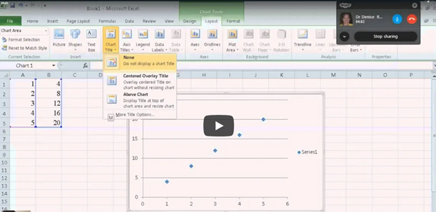
Next, it’s time to add titles to the chart. Kaylee presses Alt + J + L to open the “Chart Layout” options, selecting T to input the chart title. Choosing to place the title above the chart, she moves forward. For the axis titles, she uses Alt + J + A + I to access the “Axis Title” options, adding the horizontal (X) axis title first. She selects W for the primary horizontal axis and types the label. Creating Excel Math Graphs involves repeating the process for the vertical (Y) axis, she selects the “Rotated” option by pressing the down arrow and enters the appropriate title.
Ready to Submit her Excel Plot Math Graph
Kaylee removes the chart legend, which is unnecessary for this excel Plot math graph. Pressing Alt + J + L + L, she selects “None” from the legend options. After exiting the title field by pressing Esc, she copies the finished graph with Ctrl + C and pastes it into a Word document using Ctrl + V. The graph is complete and clean for submission.
If you would like to submit an advanced Quadratic Formula or an inequalities graph, there are many learning options